History and Development
Point and Figure charts are unique to Technical Analysis. Their roots are in the markets and have fascinated Technical Analysts for over a hundred years. No one really knows precisely where the Point and Figure charts came from, or who invented them. It is unlikely that any one person invented Point and Figure charts. In fact they probably weren't invented at all. It is more likely that they were born out of necessity - a need to be able to record price movement quickly and efficiently while on the move.

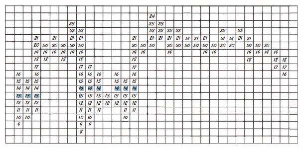
The above Figure shows how a Figure chart was born. It is important to note that it was not started as a method of charting, but more as a sequential price recording method.
Traders now had a way of recording price movements that had a number of benefits:
1. The traders could trace what the price had done during the day by following the columns.
2. They could even see what the high of the day was (24).
3. They could easily see the low (8).
4. They could see the close of the day (16).
5. They could see where most of the trading had taken place by looking at the most filled in row (20).
6. It was a portable system that could be written on a paper and did not require the plotting rigorous and precise time and price scaling of a line or bar chart. Thus, time is not an ingredient of the method.
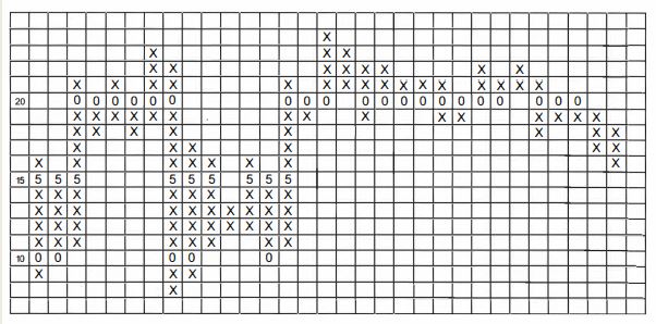
Some traders would have found it difficult to write down the price all the time, preferring instead to 'tick off' or 'mark off' the price with a dot, a tick or cross as it hit a particular price level.

By not writing numbers in each square, Point and Figure chartists had to have another way of seeing what the price level was. They introduced a vertical price scale so that the price could be marked off quickly as it moved, but they also considered the 5 and 10 levels so important that they wrote the numbers five (5) and zero (0) in the squares at these levels.

Charts constructed with Xs, 5s (fives) and Os (zeros) suffer from two problems:
It is confusing, having Xs going up as well as down. Anyone looking at the chart has to work out whether the first column is a rising or falling one, before analysis can take place. This would lead to a waste of time and would all be prone to mistakes.
It is also somewhat off-putting to see rows of Os and 5s amongst the Xs as they can be mistaken for support and resistance levels - which they are not - leading to incorrect interpretation.
The traditional chart constructed with Xs - and sometimes 5s and Os at key levels - was replaced with, in favour of a chart constructed with the letters X and 0, where Xs designated up-moves and Os designated down moves. It gave a completely new meaning to Point and Figure charts and their interpretation.


