Introduction
Market analysis is broadly categorized into two main methods, the first one is fundamental analysis and the second one is technical analysis. In fundamental analysis, an analyst needs to look at the financial statements of a company, its business model, overall macroeconomic scenarios, management capabilities, and many more things for finding a specific fair value of a company. On the other hand, technical analysis is not at all concerned with this detailed study of fundamental factors. On the contrary, a technical analyst only looks at the price of a stock derived as a result of supply-demand interaction. For a technical analysts’ price is supreme and he or she sees price as a manifestation of every fundamental reality. Hence, they look only at two main aspects of the market. Price -over -time and volume.
The entire discipline of technical analysis is based on these two data points, price over time and volume. All patterns, indicators, concepts are derived from these two basic data points. Technical analysis is a very interesting subject. This is not a definitive science, rather a probabilistic discipline. In simple terms, it is more of an art than science. There are well-known chart patterns or indicators in the market. But nothing works 100% of the time. We still follow them because they work more number of times than they fail. Hence emerged the concept of probability, the number of times anything works among the number of times that occur. This ratio is different in different stocks in different phases. That is why it is called an art. With experience, a chartist is able to form an opinion of his or her own so that he has some extra edge on the market assessment than someone having just bookish knowledge of technical analysis. This basic module on technical analysis is your stepping stone towards the journey to becoming a seasoned technical analyst. We request you to go through the concept slowly one at a time and keep observing charts on a regular basis. Look at old charts and also look at contemporary live charts. Once you find a pattern or some indicator try to predict the future move and note down your prediction. Then as time flows try to match the price action with your prediction. Then analyze why it worked or not worked. Make notes and progress with the module and the notes. This is a long journey and we wish you the best of luck.
Types of Charts
Earlier, we were introduced to the basic concept of technical analysis. Chart reading is a primary step for studying technical analysis. In this unit, we will discuss the different types of charts.
Charts are a two-dimensional representation of price over time. There are different types of charts available. But most popular and widely used among them are Line Charts, Bar Charts, and the Candlestick Charts. The X-axis, i.e. the time axis is crucial. The unit can be month, week, day, hour, 5 min, or a few seconds. The shorter the time period, the more detailed the chart becomes. The beauty of time in technical analysis is that the same concepts apply to charts irrespective of the time-frame of observation. However, the success rate of individual patterns or indicators-based decisions may vary across time frames. Generally higher the time frame of the chart, relatively higher is the probability of any concept in the market.
Line Charts
In line chart, each and every price point is represented as a dot. The X-axis represents the time scale and the Y-axis represents the price. Each dot or point represents the closing price at the end of a unit of time. These points are then joined to form a line. This is the simplest form of a chart. But this is quite good if we want to plot 3-4 similarly priced stocks in a single chart and compare. Moreover, the line chart gives the clearest idea about the price direction of a stock.
Here is an example of Line chart:

Bar Charts
A bar chart is comprised of a series of bars. Every bar has four important price points - open, close, high and low. The bars are represented in green or blue color when close is higher than open and red color when the close is lower than open. The bar charts are more detailed than the line chart and are good for demonstrating or spotting the classical price patterns. We will discuss the classical chart patterns in appropriate time.
Here is an example of Bar chart:

Candlestick Chart
The concept of candlestick charts came from Japan. That is why they are often referred to as Japanese candlestick charts. These charts are the most versatile and popular form of chart representation. Price behavior during each time unit is represented in the form of a candle. If the closing price of a stock is higher than the open price during a particular time period, then the candle is green or blue, if the close price is below the open price then the candle is red. Each candle has a body and two wicks. The distance between open to close is represented by the body of a candle and the upper and lower wicks represent the highs and lows of a candle.
Note: A Bullish candle can be represented in green, blue or un-filled (white) colour. A Bearish candle can be represented in red or filled (black) colour. It must be assumed here we are using blue as bullish candle and red as bearish candle for our study in all the candlesticks charts.

Candlestick chart is special not only because it adds a special visual clarity about the price action, but also because often a single candlestick or two or three consecutive candlesticks together form a pattern that indicates the reversal of a prior move or give conviction on the continuation of the ongoing move. These are called candlestick patterns. We will discuss them in due course of time.
Here is an example of Candlesticks chart:

Note: There is another type of chart named Point & Figure. Due to the complexities of understanding the concept, we have prepared a separate module. Click the link to visit the module.
Trends
Stock prices always move in trends. After learning the different types of technical charts, in this section, we will discuss the different types of market trends.
Market Trend and Range-Bound Consolidation
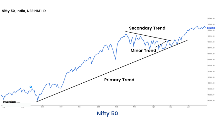
Often market movements happen in the form of trends. A price trend is a continuous or a directional price movement in upward or downward direction. We call them uptrend and downtrend respectively. Now if we look at price action in the market through charts, we will find that no price movement happens in a straight line.
Suppose we are looking at a broader uptrend represented as primary move, we may find intermediate corrections represented as a secondary trend and minor counter moves among the secondary moves represented as minor trend. This is how the market behaves generally in both the up and the downtrends.
Here is an example of Market Trends:
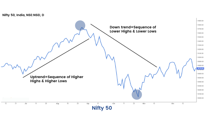
Often an uptrend is represented in the form of a sequence of higher highs and higher lows. Similarly, a downtrend is represented as a sequence of lower lows and lower highs. A trend is said to reverse when the sequence is broken.
Here is an example of Trend Reversal:
We should remember a simple point that the market is not trending all the time. Often the market consolidates within a small range and goes nowhere. Then suddenly it can break on the upside or downside.
Here is an example of Market Consolidation:

Trendline & Channels
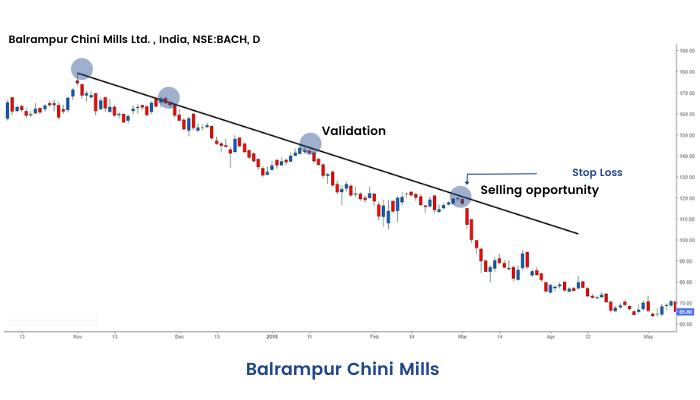
Trendline and Channels are one of the most simple and useful tools in the market. During an uptrend, a trendline is formed by joining the lowest points of periodic pull-backs, defined as secondary moves in the previous section. The up-trend line has a positive slope. To be precise we need two lows to join to form a trendline during an up-move. This line is then extended in the upward direction; the third move towards the trend-line is used to validate the trend line. If the trend line is not broken in the pullback, then it is called trend-line validation. It is often observed that price pulls back towards the trend line and moves higher. In an up-trending market, it is often easier to make money if one buys near the trend line and sells higher. The more number of time the trend-line is validated, the more important it becomes. An upward trend line is said to be the area of support. The selling pressure meets the buying pressure here and eventually, overtime when buying pressure is higher than selling pressure price sees an upward bounce.
Here is an example of an Uptrend:
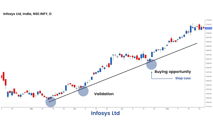
Now when one buys he or she is looking for the prices to move higher. But this may or may not happen. Hence the investor should maintain a stop-loss point below which he or she should cut his or her position, i.e. book loss.
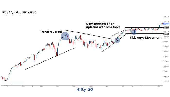
When a trend line is broken, either the market may reverse the trend, continue the uptrend with little less force or just go sideways.
Here is an example of Uptrend Reversal:
Similarly, during a down-trend: a trendline is formed by joining pull-back highs. They slope downwards. Just like an up-trend line a down-trend line is formed by joining two points and then extended in a downward direction. Pullbacks towards the trend-lines are low-risk points for short selling with a stop loss little above the trend line. The more times the line is validated, the more it grows in importance.
Here is an example of Downtrend:
Similar to an uptrend-line, when a down-trending line is broken the trend may continue with less pace, or reverse or may go side-ways. A downward trend line is said to be the area of resistance. The selling pressure meets the buying pressure here and eventually, over time, when selling pressure is higher than buying pressure price, sees a decline.
Role Reversal
Once a trendline support or resistance is broken, its role is reversed. If the price falls below a support line, that line will become resistant. If the price rises above a resistance line, it will often become support. As the price moves past a line of support or resistance, it is considered that supply and demand have shifted, causing the breached line to reverse its role. For a true reversal to occur, however, it is important that the prices make a strong move through either the support or resistance line.

Channels
The concept of a channel is much similar to trend lines. When in an uptrend or in a downtrend or in consolidation, we see rhythmic movement in the form of a parallelogram, we can draw channels. The channel boundaries are good points for reversal trades with small stop losses.
Here is an example of Channels:
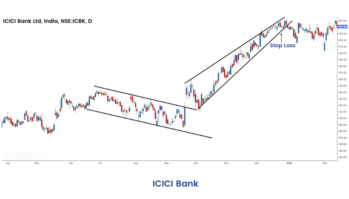
Once the price is out of the channel, the trend or range of the stock is broken.
Volume
In this section, we introduce the second aspect of charting. This is called volume. Traded volume is the number of quantities a stock has changed hands. The volume is shown as a subgraph in the price-time chart, below the price window. Higher the volume in any particular move, the greater is the conviction in that move to continue greater distance in that direction. However, if the volume is on the lower side during a move, the stock is generally bound to lose momentum.
Generally, during range-bound phases, the volume is low.
An important point regarding volume is that traded volume in absolute terms has no significance.
When we talk about higher or lower volume, it is relative to average volume over certain time periods.

Apart from traded volume, one important concept regarding volume is delivery %. In the market, a person can first buy shares and sell by the end of the day. He or she can do the reverse too. This is called intra-day trading. However, if an investor is having a positive view he may buy the share and carry forward it for a number of days. This is called taking delivery of a share. Hence if there is a price rise of a stock with a high % of delivery volume, then this signifies a positive conviction in the stock. Similarly, if a lot of people are long term negative about a stock, they may sell the stock and give delivery. Markets are driven by buyers and sellers. People who have a positive view of security are called bulls and people who have a negative view are called bears. The price of a security in a market is determined by supply-demand dynamics of any stock. If the supply is high and a lot of people are looking to sell the stock, then there are fewer available buyers, and the price is likely to decline. Hence a fall in price with high delivery % is considered negative for a stock.
Classical Chart Patterns
As we have discussed in the previous section, that market can be either in the trending phase or in a range-bound phase. No trend generally lasts forever in the market. After prolonged or medium or shorter duration up and downtrend, the market often reverses and a move starts in the opposite direction of the prior move. Often we find that well defined geometrical patterns are formed in the chart which provides a good indication of price reversals. These patterns are called reversal classical chart patterns. When they are formed as a bullish reversal pattern they are said to be part of accumulation. On the other hand, if they are formed at the top of a price move just before a bearish reversal, then they are part of the distribution.
However, a geometrically shaped consolidation does not necessarily mean price reversal. Often price resumes the erstwhile trend post the consolidation move. These are called continuation classical chart patterns. We will discuss a few of them in the upcoming sections of our module.
Head and Shoulder & Inverse Head & Shoulder
Head and Shoulder pattern is a bearish reversal pattern. This pattern appears after an uptrend. This pattern is formed with three consecutive tops with the middle one being higher than the other two. The middle top is called the head and the two side peaks are called the shoulders. On joining the intermediate troughs, we get the neck-line. On an ultimate break below the neckline, usually, a short trade is taken with a stop-loss above the top of the nearest shoulder. The target is usually considered as the distance between the neckline and head, projected from the point of break. If the volume in the down leg of the right shoulder is on the higher side and breakout happens with high volume, the conviction is on the higher side for the reversal.

An Inverse Head and Shoulder is just a mirror image of the Head and Shoulder pattern. This should appear after a sustained down trend, the rule of stop loss and target are similar. This often acts as a very effective bullish reversal pattern.
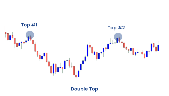
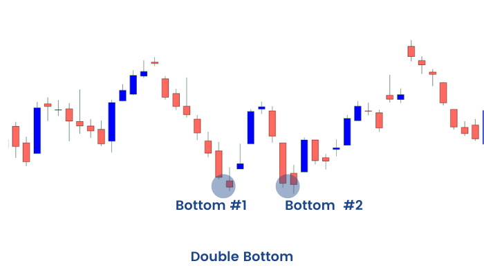
Double Tops and Bottoms
These chart patterns are well-known patterns that signal a trend reversal – these are considered to be one of the most reliable patterns and are commonly used. These patterns are formed after a sustained trend and signal to chartists that the trend is about to reverse. These patterns are created when price movement tests support or resistance levels twice and is unable to break through. These patterns are often used to signal intermediate and long-term trend reversals.
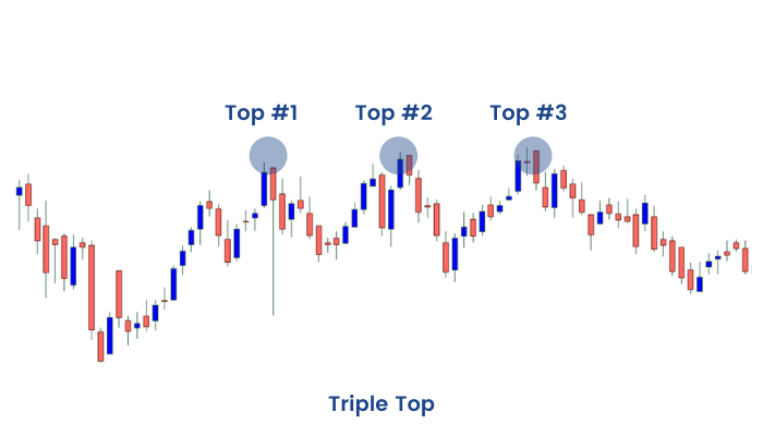
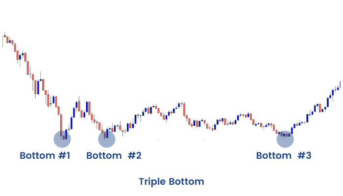
Triple Tops and Bottoms
These are another set of reversal chart patterns in chart analysis. These are not as prevalent in charts as Head and Shoulders and Double Tops and Bottoms, but they act in a similar fashion. These two chart patterns are formed when the price movement tests a level of support or resistance three times and is unable to break through. They signal a reversal of the prior trend. Trade entry is initiated at the break of a neckline with a small stop-loss and the target is measured as the distance between peaks/troughs and the neckline.
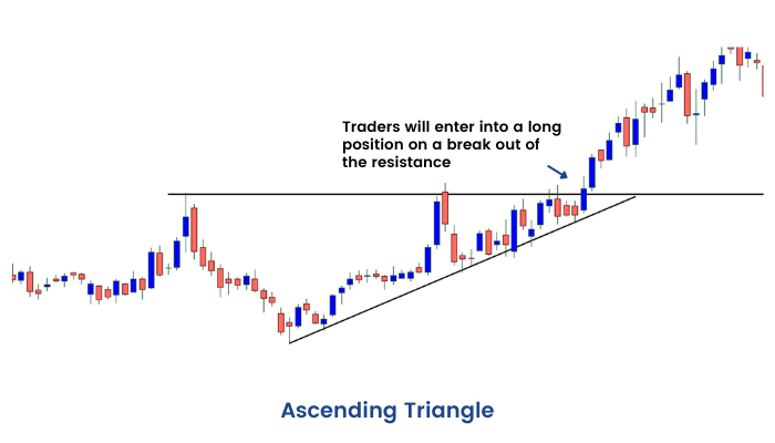
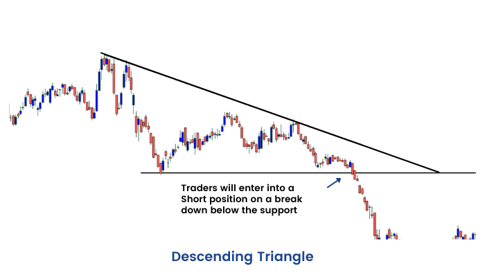
Triangles
Triangles are one of the most well-known chart patterns used in technical analysis. The three most common types of triangles, which vary in construction and implications, are Symmetrical Triangle, Ascending Triangle, and Descending Triangle. These chart patterns are considered to last anywhere from a couple of weeks (ideally more than 12 weeks) to several months. These are areas of consolidations after a trending move and are generally continuation patterns, i.e. the erstwhile trends resume after the breakout. However, in certain cases, they act as reversal patterns. They can appear both in up-trend and down-trend.

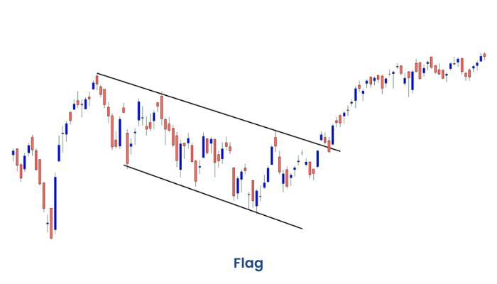
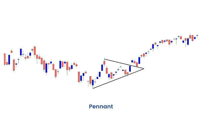
Flag and Pennant
These two short-term chart patterns are continuation patterns that are formed when there is a sharp price movement followed by a generally sideways price movement. The patterns are generally thought to last from one to three weeks (Can last from 1 to 12 weeks but ideally they should last between 1 and 4 weeks). They can appear both in up-trend and down-trend.
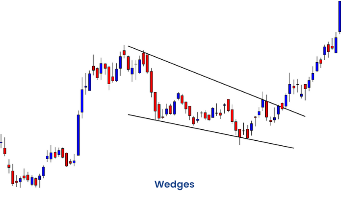
Wedge
The Wedge chart pattern can be either a continuation or a reversal pattern. It is similar to a Symmetrical Triangle except that the Wedge Pattern slants in an upward or downward direction, while the symmetrical triangle generally shows a sideways movement. The other difference is that Wedges tend to form over longer periods, usually between three and six months. The fact that Wedges are classified as both continuation and reversal patterns, can make reading signals confusing. However, at the most basic level, a falling wedge in and is bullish and a rising wedge in a downtrend is considered bearish.
Candlestick Reversal Patterns
While discussing candlestick charts in Unit 2 of this module, we had mentioned that they have the edge over many other types of chart representation due to recognizable chart patterns, which are easy to define and work beautifully in the market.
In this section, we will discuss a few popular candlestick patterns. Candlestick patterns provide entry and stop-loss criteria, but there is no target setup as available in classical chart patterns.
Join our candlestick pattern course and harness the potential of candlestick patterns to enhance your trading strategies
Hammer
Hammer is a single candlestick bullish reversal pattern. This occurs after a prolonged down trend. Ideally, there should be a gap down opening and bears should be able to push the price lower as a continuation of a down-move. At this point, bulls should overpower bears and push prices higher and make close to the opening price. The candle formed in this process should have a small body, a big lower shadow, and a negligibly small upper shadow. Ideally, the lower shadow should be at least twice the length of the body. The color of the body can be either green or red, but if the body color is green, then the hammer is considered a little more bullish, as the bulls were strong enough to close the price higher than the open price. The next day or in the next two to three days, ideally there should be a gap up opening or price should move above the high of the hammer candle. This is called confirmation or validation of the pattern. A hammer like a candle, without validation, has no real significance. If price moves above the high of the hammer a buy trade can be taken with a stop loss below the low of the candle.


Shooting Star
A shooting star is just like a mirror image of a hammer candle. First, there should be a sustained up trend and then there has to be a gap up opening. The bulls should push the price higher in the initial part of the day. Then, later in the day bears should take in the control of the stock and push prices down. Eventually, the closing price should be very close to the opening price, resulting in a candle with a small green or red body, a big upper shadow, and a small or negligible lower shadow. The upper shadow of the candle should be at least twice the length of the body. Now confirmation of the shooting star pattern comes if the price moves below the low of the candle within the next 2-3 candles. On confirmation, a short trade should be taken with stop loss above the high of the candle. A shooting star pattern with a red body is considered slightly more bearish than one with a green body. It is often observed that the shooting star candlestick pattern acts as a bearish reversal pattern and triggers a down move after an uptrend.

Inverted-Hammer
An inverted hammer is a single candlestick bullish reversal pattern. The pattern appears after a sustained down-trend. At the beginning of the day, there should be a gap-down opening. However, bulls should push the price higher during the course of the day. Eventually, the bears should push the price lower during the course of the day and close near the open price. The resulting candle should have a small body, red or green, the upper wick should be at least twice the body of the candle and the lower shadow should be quite small or negligible in size. If the body is green it is relatively more bullish than if it is red. This looks like an inverted hammer as the name suggests. The philosophy is that bears were not able to push the price below the opening price during the course of the day. This pattern, however, is considered to be a little less bullish than the hammer itself, because in hammer bulls are able to force a higher close by the end of the day. The confirmation of the pattern comes once the price moves above the high of the candle. On confirmation, a buy trade can be initiated with a stop loss below the low of the candle. The inverted hammer occurs a little less frequently in the market as compared to the hammer pattern.

Hanging Man
Hanging Man is a single candlestick bearish reversal pattern. This appears after a sustained up-move. The candle looks like a hammer; the only difference is that it appears at the end of an up-trend. The candle should have a small body at the top (red/green) and a lower shadow at least twice the length of the body. There should be very small or no upper shadow. A red colored body of hanging man pattern is more bearish than a hanging man pattern with a green body. The confirmation of the pattern happens when the price moves below the low of the candle. On confirmation, a trader may take short trade with a stop-loss above the high of the candle. The hanging man pattern is the bearish counterpart of Bullish inverted hammer. However, this appears much less frequently than shooting star which is another bearish reversal pattern.

Bullish Engulfing Pattern
Bullish candlestick pattern is a two-candlestick bullish reversal pattern. First, there should be a downtrend. Then we should have a red candle followed by a green candle. The body of the green candle should engulf the body of the first red candle. The idea is in the second candle that constitutes the pattern, the day started below the previous day’s close on a bearish note. However, as the day progresses, the bulls take-over the charge and eventually succeed to close above the previous day’s high. In such a scenario, if the highest point of these two candlesticks is breached on the upside within the next 2-3 candles, the bearish engulfing pattern is said to be confirmed. A buy trade can be initiated upon confirmation with a stop-loss below the low of the two candlestick patterns.

Bearish Engulfing Pattern
Bearish Engulfing pattern is just a mirror image of a bullish engulfing pattern with bearish implication. First, we should be having an up-trend. Then we should have a green candle as a continuation. The next day should see a gap up above the close of the previous day. The 2nd-day candle should eventually close red with its body totally engulfing the body of the first candle. The confirmation comes when within the next 2-3 candles the price moves below the low of the two candles forming the Bearish Engulfing pattern. On confirmation, a trader may take a short trade with stop loss above the top of the two candlestick patterns. Larger the second candle, the more bearish the pattern.

Piercing Pattern
The piercing pattern is just similar to the bullish engulfing pattern; the only thing is that the 2nd candle in the two candlestick patterns does not close engulfing the body of the first candle. Instead, it closes crossing the halfway mark of the body of the first candle. Confirmation comes when price crosses the high of the two candlestick patterns within the next 2-3 candles. On confirmation one may take a buy trade with stop loss below the low of the candle.

Dark Cloud Cover
The Dark cloud cover is a two candlestick bearish reversal pattern and much similar to the bearish engulfing pattern. In this pattern, the second candle, unlike the bearish engulfing pattern falls short of engulfing the first candle, instead, it crosses 50% the body of the first candle. The confirmation comes when a candle breaches the bottom of the pattern. On confirmation, a short trade can be taken with stop loss above the high of the candle.

Doji
The Doji is a single candlestick pattern. The Doji assumes significance when it appears after a trending move, be it up or down. The Doji symbolizes indecision and after a Doji, the incumbent trend can reverse, go sideways or continue the uptrend. However, the appearance of a Doji is a signal of caution that the probability is high that the erstwhile trend may be coming to an end. Doji is a candle that has open and close almost at a similar level. There can be upper shadows and lower shadows of various proportions.

Frequent Asked Questions
How to identify a reversal candlestick pattern?
Reversal candlestick patterns signal a potential change in the prevailing trend. They are identified by specific formations of one or more candlesticks, often appearing at the end of an uptrend (bearish reversal) or downtrend (bullish reversal). Look for patterns like engulfing patterns, hammers, shooting stars, and dojis at key support or resistance levels. Confirmation from subsequent price action is important.
What’s the difference between a reversal candlestick and a continuation candlestick?
Reversal candlesticks suggest a change in the current trend, signaling a potential shift from bullish to bearish or vice versa. Reversal candlestick examples are engulfing patterns and hammers. Meanwhile, continuation candlesticks suggest a pause or consolidation within the existing trend, this indicates that the trend is likely to continue. Continuation candlestick examples are doji and rising/falling three candlestick patterns.
What indicators work best with candlestick reversal patterns
Candlestick patterns are most effective when used with other technical indicators. Volume is important for confirming breakouts or breakdowns signaled by these patterns. Moving averages can help identify the prevailing trend. Technical indicators like RSI and MACD can confirm overbought or oversold conditions, increasing the reliability of reversal signals. Support and resistance levels also play a significant role.
How to trade using reversal candlestick patterns in volatile markets?
In volatile markets, candlestick patterns can generate more false signals. It's crucial to use wider stop-losses to accommodate larger price swings. Confirmation from other indicators and strong volume becomes even more important. Consider reducing position sizes to manage risk effectively. Avoid relying solely on candlestick patterns in highly volatile conditions.
How reliable are reversal candlestick patterns in predicting market trends?
Reversal candlestick patterns are not foolproof patterns. While they can provide valuable insights into potential trend changes, they should not be used in isolation. Their reliability increases when combined with other technical analysis tools and fundamental analysis. Confirmation from subsequent price action and volume is essential.
What are the top bullish and bearish reversal candlestick patterns?
Top bullish reversal patterns include the hammer, bullish engulfing, morning star, and piercing line. These typically appear at the end of downtrends. Top bearish reversal patterns include the shooting star, bearish engulfing, evening star, and hanging man. These usually form at the end of uptrends. Recognizing these patterns at key support/resistance levels increases their significant.
Technical Indicators
Since we have learned the basics of technical analysis from our previous units, we are now going to learn an essential component of technical analysis in this unit: Indicators.
Indicators are tools to aid decision making in the market. There are various types of indicators that measure or indicate the trend, the momentum, the volatility, and various other aspects in the market. There are thousands of indicators that are derived out of the price and volume data over time. Here we introduce you with four very useful indicators.
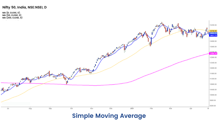
Simple Moving Average
Simple Moving Average or SMA is a moving average which is calculated by adding the closing price of security prices for the last n-periods and dividing it by the total number of time periods.
For example, suppose we want to calculate the 9 periods SMA of a security price.
First, we will add the last 9 Days Closing Price of the security, and then it will be divided by the 9 periods.
The calculation for 9 periods SMA:
(P9+P8+P7+P6…. +P1)/9
Where,
P=Price
P9= Closing Price 9 days ago
SMA is a Technical indicator that is represented by a line and it is directly plotted on the security price. As per the choice of the trader, the periods can be changed in the SMA indicator.
For shorter-term SMA, we can use 5,8,13, etc. For Medium term 20, 34, 50, and for longer-term 100,200 can be used.
If a medium-term moving average is having a positive slope, the trend is considered to be positive in the medium-term and vice versa.
Price breaching a particular moving average from down to up is considered a bullish sign. Similarly, price breaching a particular moving average from upside and closing below is considered bearish.
If we find a shorter term moving average crossing a medium-term moving average from below, often this is called bullish crossover. On the other hand, if a shorter-term moving average crosses a medium-term moving average from upside to below that is called a bearish crossover and often considered a signal of bearishness.
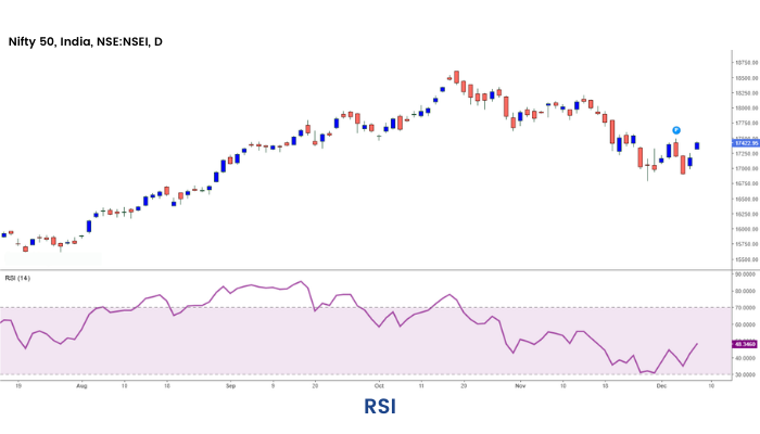
RSI
Relative Strength Index (RSI) is a momentum oscillator, developed by J. Welles Wilder, which measures the speed and velocity of the price movement of trading instruments (stocks, commodity futures, bonds, forex, etc.) over a specified period of time.
The objective of the RSI indicator is to measure the change in price momentum. It is a leading indicator and is widely used by Technical Analysts over the globe. RSI can be used to spot a general trend. It is considered overbought when it goes above 70 and oversold when it goes below 30. The 30-70 region of RSI is considered to be a normal zone.
Calculation:
The formula for calculating the Relative Strength Index is as follows
RSI = 100 – 100 / (1 + RS)
RS = Average Gain over a specified period/ Average loss over the same period
The default setting for the Relative Strength Index is 14, but you may change this value to decrease or increase sensitivity based on your requirement.
Usage
There are many uses of RSI. However, the most popular ones are, if we find that RSI breaching the 70 levels and at the same time we spot a bearish reversal pattern, then there is an opportunity to take short trade with stop loss. Similarly, if RSI breaches 30 from below to above and we observe a bullish reversal pattern, there is an opportunity to take long trade with stop loss.
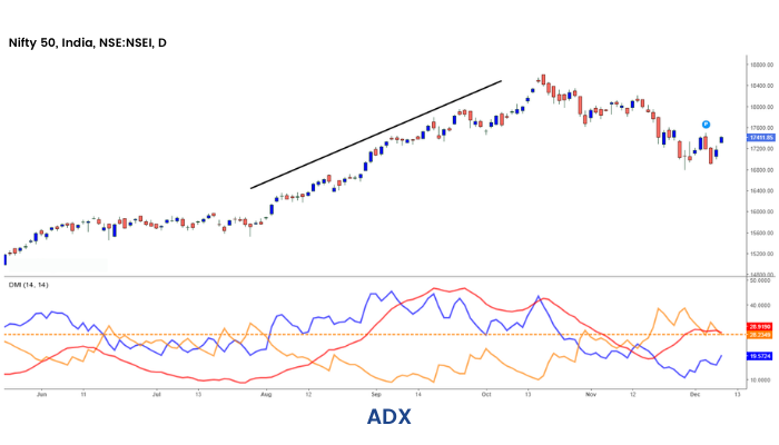
ADX
In 1987 J. Welles Wilder developed the Average Directional Index (ADX) as an indicator of trend strength.
ADX quantifies the velocity of the price regardless of its north/south/eastward movement.
Hence, two other lines i.e. Positive Directional Indicator (+DI) and Negative Directional Indicator (-DI) are used on the charting system which acts as complements to ADX.
When ADX is above 20 or 25, generally Market is considered to be in a trending phase. The trend can be up or down. On the other hand, +DI crosses the -Di line from below, the market generally moves up and when the -DI line crosses the + DI line from below, the market generally moves in the downward direction.
Conclusion
As we have come to the end of this module. Let's sum up the topics we have covered. We have covered the basics of technical analysis and focused on the different types of charts, chart patterns and most popular candlestick charts. But learning does not end here; there are a lot more things to learn in technical analysis. We have prepared many such modules on different topics of technical analysis and more on topics related to financial markets. Be sure to check them out on ELM School.


