Introduction
This module introduces another important topic of technical analysis, which is Chart Patterns. These are the distinctive pattern formations created by the movements of security prices on a chart over a period of time. While analyzing price charts, these distinctive patterns help to predict future price movements of any financial security. So, let us start this module and first understand the concepts of chart patterns.
What are Chart Patterns?
Price Patterns are pictures or formations, which appear on price charts which can be classified into different categories, and have a predictive value.
When the prices are not trending, they are said to be moving sideways. These sideway movements many a times conceive major moves. The sideways moves have the potential to deliver a major change in trend; Patterns are formed in the period of transition from sideways to trending markets. It puts all buying and selling that’s happening in the stock market into a concise picture. It provides a complete pictorial record of all trading, and also provides a framework for analyzing the battle between bulls and bears.
Chart pattern analysis can be used tomake short-term as well as long-term forecasts. The data used by the chart patterns can be intraday, daily, weekly, monthly or yearly.
Why is it Important to analyze the Chart Patterns?
Chart patterns are a great way of viewing price actions which occur during the stock trading period. They tend to repeat themselves over and over again which helps to appeal to human psychology and trader psychology in particular. If you are able to learn and recognize these patterns early, they will help you to gain a real competitive advantage in the markets.
Just as volume, support and resistance levels, RSI, and Fibonacci Retracements and other technical indicators, stock chart patterns help in identifying trend reversals and continuations. We will discuss the different types of chart patterns in the next section of this module.
Types of Chart Patterns
What are the different types of chart patterns?
Chart patterns can be basically classified into: Reversal and Continuation Patterns
- Reversal patterns indicate that an important reversal in the trend is taking place.
- Continuation patterns suggest only a pause in the current trend, after which the main trend will resume.
Reversal Patterns
There are some preliminary points which needs to be kept in mind for all reversal patterns.
- Existence of a prior trend.
- The first signal of an impending trend reversal is often the breaking of an important trendline.
- The larger the pattern, the greater the subsequent move.
- Topping patterns are usually shorter in duration and more volatile than bottoms.
- Bottoms usually have smaller price ranges and take longer to build.
- Volume study is very important.
Examples of common reversal patterns are: Head and shoulder, Double top / bottom, Cup and handle and many more.
Continuation Patterns
- Continuation patterns are an indication that the current trend is in a pause mode.
- These patterns occur in the middle of a trend and signal that once a pattern has completed, the trend will most likely resume.
- All kinds of time frames can be scoured for continuation patterns, such as tick charts, daily or weekly charts.
Examples of common continuation patterns are: Triangles, flags, pennants, and rectangles.
Note: Under reversal patterns & continuous patterns, several types of chart patterns exist that we will learn in our upcoming units.
Head and Shoulders Chart Pattern
First let us begin with ‘Head and Shoulders pattern’
What is a "head and shoulder pattern"?
The Head and Shoulders pattern is quite popular amongst the market participants due to its reliability in the past and of course the success ratio. Traders often study trends and patterns when analyzing the market, in hopes of detecting the next most probable price movement.
Let’s understand the pattern in detail.
This is a reversal pattern and can act both as a bullish and bearish reversal pattern depending upon the prior trend and type of this pattern. The usual pattern is formed after an established uptrend.
This pattern gives a market reversal signal post breakdown from the neckline which is accompanied by heavy volume.
The neckline is basically the horizontal line which joins both the troughs to each other.
The possibility of breakdown increases if the slope of the neckline is flat to downward sloping and the right shoulder is relatively smaller or equal to the left shoulder.
Post breakdown from the pattern, there may be a possibility of retesting the neckline. The further breakdown is also accompanied with heavy volume which gives confirmation of the weakness.
The pattern can be formed in any time frame from a few minutes to weekly and monthly charts. However, higher the time frame, higher is the chance of success.
It’s important to keep in mind that this pattern is almost never perfect. There will likely be small price fluctuations in between the shoulders and the head, and the pattern formation is rarely perfectly shaped in its appearance.
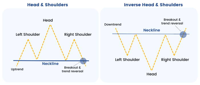
What does the inverse head and shoulders pattern mean?
Inverted pattern is exactly a mirror image of the original pattern but is formed after a prior downtrend and is usually a bullish reversal pattern.
How to Interpret the Pattern?
This pattern is one of the popular patterns amongst the trader due to its pre-determined price target estimate after breakdown from the neckline.
The minimum target is vertical distance from the head to the neckline post breakdown. Usually one can place stop loss at the high of the right shoulder and trail the same as the price corrects. With an inverse pattern, stops are usually placed at the low of the right shoulder.
Example of Head and Shoulders pattern:
Head and Shoulder pattern example Escorts Ltd
This is an example of this pattern formed in the daily chart of Escorts where post breakdown from the neckline, the stock witnessed sharp selloff and achieved the pattern target (shown by the blue line) in mere single candle.
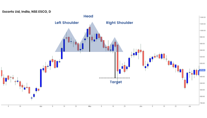
Moreover, the breakdown was also supported with high volume which further confirmed the weakness.
Example of Inverse Head and Shoulders pattern:
Inverse Head and Shoulder Pattern example Bandhan Bank
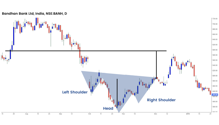
The above image is an example of an Inverted pattern that was formed on the daily chart of Bandhan Bank Ltd.
The stock witnessed sharp movement post breakout from the pattern on very high volume. One important thing to note here is that the stock made a retest to the neckline here.
Double Top and Double Bottom Chart Pattern
Next, we will learn another type of chart pattern i.e. ‘Double Top and Double Bottom’
What are Double Top and Double Bottom Chart Patterns?
Double top and bottom patterns are chart patterns that occur when the prices of the stock move in a pattern that is similar to the letter "W" (double bottom) or "M" (double top). These patterns usually move over a longer period of time.
What is Double top?
A double top is another bearish reversal pattern that is very commonly used by the traders. The stock price will form a peak and then retrace back to a level of support. It will then form a peak once more before reversing back from the prevailing trend. It looks like the “M” pattern.

What is Double Bottom?
A double bottom is a bullish reversal pattern that is totally opposite of a double top. The stock price will form a peak and then retrace back to a level of resistance. It will then form a peak once more before reversing back from the prevailing trend.

How to identify Double Top:
When identifying the double tops on the charts, the prior trend should be an uptrend. The first top is formed as an inverted U. Similarly, the second top is formed as an inverted U, both the tops either have the same or almost the same highs.
The formation of this pattern is confirmed when the prices break through the neckline level of support and continue to move downwards. Also the volume should rise when the prices break the support.
Example:
We can see the examples of a Double Top chart pattern formed on the daily chart of Tata Motors Ltd.

How to identify Double Bottom:
When identifying the double bottoms on the charts, the prior trend should be the downtrend. The first bottom is formed as the letter U pattern. Similarly, the second bottom is formed as U, both the bottoms either have the same or almost the same low.
The formation of this pattern is confirmed when the prices break through the neckline level of resistance and continue to move upwards. Also the volume should rise when the prices break the resistance.
Master P&F trading strategies - Join us and Start learning now!
Example:
We can see the examples of a Double Bottom chart pattern formed on the daily chart of Tata Motors Ltd.

Stop Loss and Price Target:
The minimum target is vertical distance from the M or W top, to the neckline post breakdown. Usually one can place stop loss above the neckline and take up a short trade as the neckline breaks.With an inverse pattern, stops are usually placed below the neckline and a long trade is taken up as the neckline is breached on the upside with high volumes.
Double top and bottom formations are highly effective when they are identified correctly on the charts. However, you may incur losses when they are interpreted incorrectly. Thus, one should be careful and patient before trading this chart pattern.
Triple Tops and Bottoms
Similar to double tops & double bottoms we learned in our last unit. Now, we will discuss triple tops & triple bottoms.
What are Triple Tops and Bottoms?
These are another type of reversal chart patterns in chart analysis. These are not as prevalent in charts as Head and Shoulders and Double Tops and Bottoms, but they act similarly. These two chart patterns are formed when the price movement tests a level of support or resistance three times and is unable to break through; this signals a reversal of the prior trend.


How to interpret Triple Tops and Bottoms?
As triple tops and bottoms are a reversal pattern, there should be an ongoing trend for reversing. In the case of the Triple Top Reversal, it should be formed at the end of an uptrend and In the case of the Triple Bottom Reversal; it should be formed at the end of a downtrend.
All three highs should be almost equal in the triple top pattern and all the lows should be equal in the triple bottom chart pattern. After the third high or low rise in the volume confirms the formation of this pattern.
Example:
We can see the examples of the Triple Top & Triple Bottom chart pattern formed on the daily chart of Infosys Ltd.


Price target and Stop loss:
In the case of Triple Top, the target should be measured from the neckline to the highs and In the case of Triple Bottom; the target should be measured from the neckline to the lows. Stop-loss can be placed at the highs or lows respectively.
Technical analysts can use this chart pattern for evaluating past and current market activity, and also to forecast future price action to make trading and investing decisions.
Cup and Handle Chart Pattern
Now we will learn a different type of chart pattern that depicts the shape of a cup & handle in the price chart.
What is a Cup and Handle Pattern?
Cup and Handle pattern is one of the most important chart patterns to identify multi-bagger stocks. They normally give multifold returns.
The Cup is usually U-shape and the handle is basically the retracement from the prior top to about 1/3rd of the vertical height of the cup and looks quite similar to a bowl. This pattern simply shows a period of consolidation followed by a breakout.
Cup and Handle pattern can be seen both as a bullish continuation or reversal pattern.
A continuation pattern is formed when there is a prior uptrend, followed by a consolidation in the form of Cup and Handle pattern and then the uptrend continues post breakout.

On the other hand, a reversal pattern occurs after a prolonged downtrend and reverses the prior trend.

This can be formed in any time frame from a few minutes to weekly and monthly charts. However, higher the timeframe, better the chances of success post breakout.
How to interpret this pattern?
1. Cup
The Cup is usually “U” shaped and may be considered as a rounding bottom with almost equal highs on the either side. However, a “V” shaped cup also qualifies as a Cup and Handle pattern but the conviction is higher in “U” shaped due to the consolidation at the bottom.
2. Handle
The handle is usually the pullback from the higher end of the cup which may be rounding, triangle or a descending channel. Usually the pullback is about 1/3rd of the size of prior advance.
The smaller the pullback, the better is the strength of the formation and higher the possibility of breakout.
3. Volume pattern
The breakout from the handle’s resistance should be accompanied with increased volume thus confirming the same.
4. Period
The cup usually forms over a period of 1-6 months or even longer than those formed in weekly and monthly charts. The handle ideally forms over a span of 1-4 weeks or even higher depending upon the time period of the cup.
Cup and Handle Pattern Example
Let’s understand this pattern with the help of examples.
Scenario 1: As a Continuation pattern
This is an example of Cup and Handle as a continuation pattern on the chart of Nifty 50 which was formed in a span of 2 years. The index witnessed breakout from the pattern along with a gap up which confirmed further strength.
The minimum target shown by a vertical blue line (distance from high to bottom of the cup) was achieved in less than a year’s time.

Scenario 2: As a reversal pattern
This is another example of the Cup and Handle pattern as a reversal pattern which was formed in Dhampur Sugar.

Price Target and Stop-loss:
The projected target from the breakout is usually the vertical distance from the high to the bottom of the cup.
Traders may place stop loss at the lowest point of the handle and may trail it to recent swing low as the stock makes a higher high within the consolidation area of the handle; depending upon the risk appetite of the trader.
The good thing about a Cup and handle pattern is that it has a high success ratio along with a good risk reward. But you should not forget to place your stop loss and trail your SL as the price goes up.
Moreover, you should closely monitor the volume as the breakouts with low volume are less likely to sustain. You may also confirm the strength of breakout based on other technical parameters.
Ready to master the Cup and Handle Chart Pattern? Dive into our comprehensive share market course online and level up your trading skills today!
Frequent Asked Questions
What are the rules for the cup and handle pattern?
The cup and handle is a bullish continuation pattern, signalling a potential uptrend resumption. It has two parts: a "cup," a rounded bottom resembling a U-shape (not a sharp V), and a "handle," a brief downward drift or consolidation after the cup.
Key rules-
A prior uptrend must be in place before the cup forms;
The handle should be smaller than the cup, ideally sloping slightly downwards.
Trading volume should diminish during the cup and handle formation and then surge significantly upon the breakout above the handle's resistance. This volume confirmation strengthens the pattern's validity.
How can I identify a cup and handle breakout in stock charts?
A breakout occurs when the price closes above the resistance line formed by the top of the handle. This breakout should be accompanied by an increase in volume, as it confirms the strength of the breakout and the potential for a continued uptrend. The increase in volume confirms that there is buying pressure on the stock. Without the increase in volume, the breakout may be a false signal. Traders should look for a clear break above the high of the handle to confirm that the cup and handle chart pattern has given a breakout.
What are the best entry and exit strategies for the cup and handle pattern?
Here are entry and exit strategies for the cup and handle chart pattern:
Enter a long position after the price breaks above the handle's resistance on increased volume.
Place a stop-loss order below the handle's low to limit potential losses if the breakout fails.
A common price target is calculated by measuring the depth of the cup and adding it to the breakout point.
What is the inverted or reverse cup and handle pattern, and what does it indicate?
The inverted (or reverse) cup and handle is the bearish opposite of the standard cup and handle. It signals a potential continuation of a downtrend. This chart pattern is formed after an existing downtrend. The "cup" is an upside-down U-shape, resembling an inverted bowl. The "handle" is a short, upward price drift or consolidation that follows the cup. An important signal is the breakout - when the price decisively breaks below the support line formed by the handle's low point, ideally accompanied by increased volume This breakdown confirms the pattern and suggests further downside movement is likely.
Symmetrical Triangle
Next, in this section, we will start with the different triangle patterns formed in the price chart.
But before we start, let us first understand the concept of a triangle pattern.
What are triangles patterns?
Triangles are considered to be intermediate patterns. This means that they take longer than 3 weeks to form but generally less than 3 months. A minimum of two top and two bottom points are required to construct a triangle. The minimum requirement of a triangle is 4 reversal points.
There are three types of triangles:
- Symmetric
- Ascending
- Descending
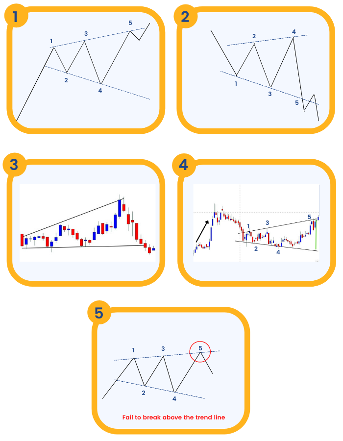
What is a Symmetric Triangle?
Symmetrical Triangles can be bullish or bearish continuation chart patterns that are developed by two trend lines that converge. These two trend lines join the peaks and troughs and they occur in the direction of the ongoing trend.
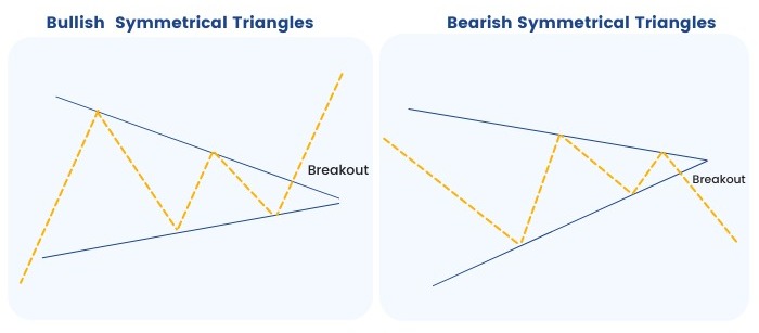
How to interpret this pattern?
- It consists of 1 down trendline and 1 up trendline – which converge.
- A closing basis breakout should be considered important while trading them.
- The completion of the pattern is marked when prices close either below the support lines along the troughs or above the resistance line along the peaks.
- The breakout from the triangle pattern should be mostly between the two thirds of the length of the triangle.
- Volume must diminish while pattern formation and should significantly increase as the pattern completes.
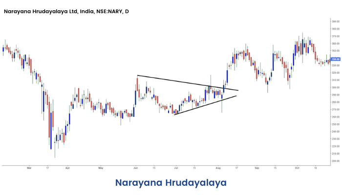
Example:
Below is an example of Symmetrical Triangle formed in daily chart of Narayana Hrudayalaya Ltd.:
Profit Target and Stoploss:
Price Target: Vertical distance of the base is the minimum target that the price should move on breakout. The stop loss can be set at the opposite end of the breakout point.
Symmetrical triangles differ from ascending triangles and descending triangles in the sense that the upper and lower trend lines are both sloping towards a center point. Whereas, ascending triangles have a horizontal upper trend line, that predicts a potential breakout higher, and descending triangles have a horizontal lower trend line, that predicts a potential breakdown lower.
Ascending and Descending Triangles
Now that we have already understood the concept of triangles and covered what are symmetric triangle patterns earlier. In this section, we will discuss ascending and descending triangle chart patterns.
What are Ascending Triangles:
This triangle appears during an upward trend and is regarded as a bullish continuation pattern. Sometimes it can also be formed at the end of a downward trend as a reversal pattern, but it is more commonly considered as a continuation chart pattern. Ascending triangles are mostly regarded as bullish patterns whenever they are formed in the charts.

How to interpret this pattern?
In the ascending triangle, the upper trend line is flat and the bottom trend line rises above. As the prices trend above with peaks and troughs, prices face resistance and there is temporary reversal. Each of the troughs forms at the higher levels. The formation of this triangle occurs when the prices close above the resistance level along the peaks. The prior uptrend continues when the price breaks the resistance. Volume is low during the formation of the pattern.
Example:
Below is an example of Ascending Triangle formed in daily chart of Birlasoft ltd:

Price target and Stop-loss:
The stop loss can be placed just at the breakout level of the triangle. For setting up the profit target, traders can measure triangle height at maximum width and then adjust that measurement according to the breakout price.
Ascending triangle mostly appears in an uptrend and is considered a continuation pattern. They are very rarely found at the downtrend,
What are Descending Triangles?
Just like the ascending triangle this is also a continuation chart pattern. The only difference is that it is a bearish continuation pattern and it is formed during the downtrend. Sometimes it can be also created at the end of an uptrend as a reversal pattern, but it is more commonly considered as a continuation chart pattern.

How to interpret this pattern?
Descending Triangles are opposite of Ascending Triangles. It is formed in the downtrend and indicates that the bears are aggressive. It has a falling upper line along the peaks and has a flat lower line along with the troughs. It signals the continuation of the downtrend with at least two or more peaks and two or more troughs. A close below the lower trend line with volume confirms the breakdown. Volume is usually low during the formation of the pattern.
Example:
Below is an example of a Descending Triangle formed on the daily price chart of SBI:

Price target and Stop-loss:
The price target for this pattern should be set by subtracting the entry price and the vertical height between the two trend lines at the breakdown. One can set a stop loss at the upper trend line.
Descending triangle mostly appears in the downtrend and is considered a continuation pattern. They are very rarely found at the uptrend.
Wedges
Next, we will learn a completely different type of chart pattern called Wedges.
What are Wedges?
Wedges are bullish and bearish reversal as well as continuation patterns which are formed by joining two trend lines which converge. It can be in the form of a rising wedge or a falling wedge. They are normally skewed triangles. The price action forms a cone that slopes down or up as the reaction highs and reaction lows converge. Rising wedge occurs when the price of the stock is rising over a time whereas falling wedge occurs when the price of the stock is falling over a time. This pattern can be drawn by using trend lines and connecting the peaks and the troughs. Once there is price breakout, there is a sharp movement of prices in either of the directions.

How to interpret this pattern?
The rising wedge chart pattern is formed when a market consolidates between two converging trend lines i.e. support and resistance lines. In order to form a rising wedge, both the support and resistance lines have to point upwards and the support line should be steeper than resistance.
The falling wedge chart pattern formed when a market consolidates between two converging trend lines i.e. support and resistance lines. In order to form a descending wedge, both the support and resistance lines have to point downwards and the resistance line should be steeper than the line of support.
Example:
Below is an example of Falling Wedge formed in daily chart of BSE Sensex:

Below is an example of Rising Wedge formed in weekly chart of Sundaram Finance ltd.:

Price target and Stop-loss:
The stop loss is usually placed below the back of the wedge. The profit target is set by measuring the height of the back of the wedge and extending that distance up from the trend line breakout.
The rising and falling wedges help us in predicting the reversals of the trends that help the traders in making appropriate trading decisions.
Pennants
Next, we will learn about 'Pennants' and how to interpret them in the price chart.
What are Pennants in Technical Analysis?
A pennant or a flag is created when there is a sharp movement in the stock either upward or downward. This is followed by a period of consolidation that creates the pennant shape because of the converging lines. Then a breakout movement occurs in the same direction as the big stock move. Pennants are similar to flag patterns and tend to last between one and three weeks.
At the initial stock movement there is a significant volume which is followed by weaker volume in the pennant section, and then rise in the volume at the breakout.
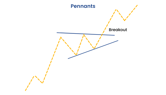
How to interpret this pattern?
This chart pattern is identified by converging two trend lines and this convergence is more horizontal in formation. This pattern also closely resembles a small symmetrical triangle. Volume declines when the formation of this pattern happens. The price breakout from pennant should duplicate the size of the move preceding it. Time taken to form a Pennant is maximum 15 – 20 candles approx.
Example:
Below is the formation of Pennant in the daily chart of BSE Sensex:

Price target and Stop-loss:
The price target for pennants is set by measuring the initial flagpole's height to the level in which the price breaks out from the pennant. The stop-loss level is at the lowest price of the pennant pattern, as the breakdown from these levels could mark the starting of a longer-term reversal.
Pennants are formed in the short term and should be completed between one to three weeks. The prior trend continues after the breakout with the burst of volume.
Flags
The chart pattern that we will learn in this section depicts something very similar to a ‘Flag’ in the price chart. Let us see how?
What are flags in Technical Analysis?
The flag pattern is a continuation pattern that is formed when there is a sharp movement in the prices that is followed by sideways sharp price movement. This pattern is completed when there is another sharp price movement in the same direction as the move which started the trend. This pattern generally lasts from one to three weeks.

How to interpret this pattern?
Flag patterns are formed in the shape of a parallelogram or a rectangle after the consolidation. When the prices of the stock move in a particular direction but suddenly an opposite trend starts to take place for a short duration then it becomes a flat pattern. As an opposite trend is formed for a short duration and the earlier trend is going to come back, this pattern should be viewed as the profit booking opportunity.
Example:
Below is the example of Flag formed in the daily chart of GMM Pfaudler Ltd.:

Price target and Stop-loss:
The stop loss can be set just outside the flag on the opposite end of the breakout. The profit target is measured as the distance between the two parallel lines.
Traders should also check the overall market trends in order to maximize the success of this flag chart pattern.
Megaphone pattern
Now in this unit, we will learn the ‘Megaphone pattern.’
What is the Megaphone Pattern?
Megaphone pattern is a pattern which consists of minimum two higher highs and two lower lows. The pattern is generally formed when the market is highly volatile in nature and traders are not confident about the market direction. Normally this pattern is visible when the market is at its top or bottom. The greater the time frame is the better the pattern will work. However, traders love this pattern when it is formed in a daily or weekly time frame.

How to identify the Megaphone pattern?
Generally, the Megaphone Pattern consists of different swings. But the swing has to have at least two higher highs and two lower lows. A trend line is drawn by connecting point 1 and point 3 while point 2 and 4 are also joined together to draw a line.
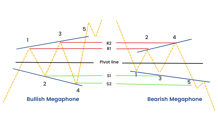
These two lines create a shape which looks like a megaphone or inverted symmetric triangle. These swings high and lows have to close above or below its pivot line and therefore they will create swing high as pivot high (R1, R2 and R3) and swing lows as pivot lows (S1, S2 and S3).
Characteristics of Megaphone trading pattern:
Below are a few characteristics of Megaphone trading pattern:
- It is a pattern which consists of minimum two higher highs and two lower lows.
- Megaphone Pattern usually appears at the top or bottom of the market.
- Inverted Symmetric triangle and broadening wedge are the two nicknames of Megaphone Pattern.
- The Megaphone Pattern always appears after a strong trend.
- Failure of a Megaphone Pattern can also be traded.
Volume:
Volume plays an important role when it comes to the recognition of this pattern. In the Megaphone Top, volume usually peaks along with prices.
An increase in the volume on the day of the pattern confirmation is a strong indicator.
Underlying Behavior:
When the pattern is forming it represents that the bulls and bears are fighting to build control of the stock.
The pattern takes place when the bulls take the prices higher.
At the time of formation of the Megaphone Top, then again, bears make the prices fall because of which lower lows are formed. However, the bears ultimately triumph.
Price Targets:
The target price refers to the potential price move that this pattern shows.
You can think about if the target price for this pattern is enough to supply an appropriate return after your costs (such as commissions) have been taken into account.
An ideal rule of thumb is that the target price should be greater than 5%, nevertheless, you should consider the existing price if the trade is going in your favor.
Discover the Megaphone Pattern and enhance your trading skills. Explore our category to learn share trading online and elevate your strategies today!
Frequent Asked Questions
Strategies for trading the megaphone pattern?
Traders typically use two main strategies: trading reversals within the pattern or trading breakouts. For reversals, buy near the lower trendline and sell near the upper trendline, using appropriate stop-losses. For breakouts, enter a long position after a confirmed break above the upper trendline or a short position after a break below the lower trendline, again with stop-losses. Confirm breakouts with increased volume.
Is the megaphone pattern bullish or bearish?
The megaphone pattern itself is neither strictly bullish nor bearish. It's considered a neutral pattern indicating increased volatility and indecision in the market. It can appear in both uptrends and downtrends and can lead to either bullish or bearish breakouts, though it's more frequently observed at market tops.
How to Trade a Megaphone Pattern?
Trading a megaphone pattern involves identifying the widening price swings between diverging trendlines. Traders look for reversals at the trendlines or breakouts beyond them. When trading reversals, use appropriate stop-losses to manage risk. For breakouts, confirm the move with increased volume before entering a trade. Be cautious of false breakouts, which are common with this pattern.
What are the risks of trading with a megaphone patter
The main risk is the high probability of false breakouts. The widening price swings can create misleading signals, which can lead to losses. The lack of a clear direction makes it difficult for traders to predict the eventual breakout direction. Therefore, traders should use strict stop-loss orders and confirm breakouts with other indicators, which is important while trading this chart pattern.
What is the difference between a rising megaphone pattern and a declining one?
Megaphone patterns, characterized by widening price swings, can be either rising or declining. A rising megaphone, occurring within an existing uptrend, shows successively higher highs and lower lows, indicating growing volatility even as the price attempts to trend upwards. This suggests weakening bullish momentum and potential for a reversal. Conversely, a declining megaphone appears during a downtrend, displaying successively lower highs and lower lows, amplifying the bearish sentiment. Both patterns, however, share the common trait of increased market indecision and volatility, making precise predictions challenging.
What is the megaphone pattern in an uptrend?
In an uptrend, a megaphone pattern signals increasing volatility as the price makes higher highs and lower lows, widening the trading range. This pattern suggests weakening bullish control and growing uncertainty. While it can lead to a continuation of the uptrend after a breakout above the upper trendline, it often precedes a trend reversal to the downside.
Channels
In this unit, we will discuss 'Channels', which is a type of chart pattern based on trendlines.
What are Channels?
A Channel, or Channel lines, can be described as the addition of two parallel trend lines that act as strong areas of support and resistance. The upper trendline connects a series of highs, while the lower trendline connects a series of lows.
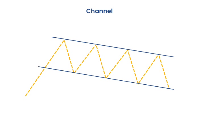
How to interpret this pattern?
A Channel can slope upward, downward or sideways. However, regardless of the direction, the interpretation still remains the same. Traders will expect a given security to trade between the two levels of support and resistance until it breaks beyond one of the levels. In this case, traders can expect a sharp move in the direction of the break. Along with clearly displaying the trend, Channels are mainly used to illustrate important areas of support and resistances.
Example:
Below is the example of Rising Channel formed in the daily chart of PNB Housing Finance Ltd.:
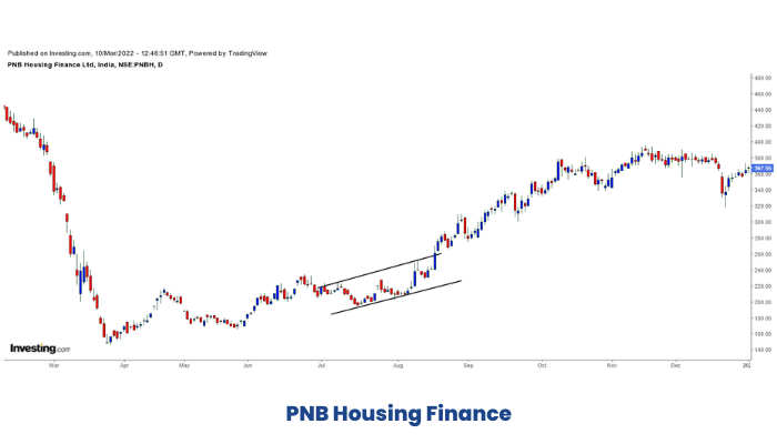
Price target and Stop-loss:
The stop loss can be set above the swing high before the price breakout from the channel. The price target can be set as the height of the channel.
Channels help the traders to buy and sell when the prices are moving between trendlines. This pattern also helps the traders to estimate stop-loss and target levels. The time taken by the channel to form helps in determining the strength of the channel.
Gaps
Finally, the last chart patterns we will learn in this section are ‘Gaps.’
What are Gaps?
A gap is formed when the closing price of the previous days and the opening price of the next day have different price levels.
This is formed mainly due to any news in that specific stock, after the trading session.
For example, if the company's earnings are higher than expected, then the stock will gap up the next day.
Why Does a Gap Occur?
A gap usually occurs when there is low liquidity in the market. There are not enough buyers or sellers to trade that stock.
It may also occur when there is a high volume in that stock.
Important events like earnings releases and company-related news that impact the market sentiment after the stock closes lead to gaps in the stock prices when the stock opens the next day.
4 Types of Price Gaps:
Gaps can be mainly classified into 4 groups:

1. Common Gaps:
Common Gaps are also sometimes referred to as a trading gap or an area gap.
This gap occurs in nervous markets and is generally closed within a few days. They can be caused by a stock going ex-dividend when the volume is low. A common gap appears in a trading range and reinforces the apparent lack of interest in the stock at that time. Knowing about these types of gaps is good, but it’s usually doubtful that they will produce trading opportunities.
2. Breakaway Gaps:
The breakaway gap usually does not get filled initially. A breakaway gap occurs when the price of the stock gaps over a support or resistance level. It is like a breakout pattern, but here the actual breakout happens in the form of a gap.This kind of gap signals strong momentum and price keeps on trending after a breakaway gap. Furthermore, the larger the breakaway gap, the stronger the next candle after the gap, and the stronger the prevailing trend will be.
3. Runaway /Continuation Gaps:
Runaway gaps are also referred to as measuring gaps. Runaway gaps in an uptrend represent traders who did not get in during the beginning of the uptrend and while waiting for a retracement in price, they decided it was not going to happen. There is increased buying interest all of a sudden. This type of runaway gap represents an almost panic state in traders. Runaway gaps can also be caused by important news events which may cause new interest in the stock. In a downtrend, runaway represents an increase in the liquidation of the stock by the buyers who are standing on the sidelines.
4. Exhaustion Gaps:
Exhaustion gaps usually get filled and the best way to trade an exhaustion gap is not to speculate but use the information to time exits and entries around the pattern. An exhaustion gap usually occurs at the end of a trend or at an important support and resistance level. The first gap in the direction of the trend can look like a runaway gap but the following candle is usually after a Doji pattern showing the indecision or rejection of a price level.
How can gaps be traded?
Traders can build a trading strategy based on the type of gaps formed.
As a rule of thumb, below are some points traders need to consider when trading gap:
- Common gaps usually should be traded in the opposite direction, as the market fills the gap after they occur.
- Continuation gaps signal a strong trend, and traders can enter in the direction of the trend after a continuation gap occurs.
- Exhaustion gaps signal trend reversals and traders should look to enter the opposite trend after they spot this gap.
With the help of the above thumb rules, both the day traders and positional traders can analyze the gaps in the charts and trade accordingly.
Conclusion
So, we have learned the different types of chart patterns, how they are formed, how to identify them and most importantly, what do they indicate. Identifying chart patterns can be useful to many traders to define their targets and stop-loss. But that's not it; to become a successful trader, there is a lot more to learn about technical analysis and trading techniques. So, we have designed many other modules like this on our ELM School that will help you to achieve greater knowledge on the topic of technical analysis and more on overall financial markets.


